Steal the landing pages of top community business
Inspiration to build a beautiful landing page for your community membership. Examples from top community businesses.
If you’re a founder like me, you’re probably never satisfied with your landing page.
“Maybe if I tweak the hero section like that, I can better address the visitor’s pain? Or maybe if i call out those features, I can make my solution feel more compelling?”
Yeah! You’re not a wasting your time…you’re iterating. And that’s productive.
Atleast that’s what I tell myself. 🙃
What helps me make progress with conviction is to look at the landing pages of other successful businesses and copy the parts that I like about them.
They have likely gone through multiple iterations to arrive at the current state. And the current state is likely the best performing yet. So, it’s not a bad idea to “steal” it. Like an artist ofcourse.
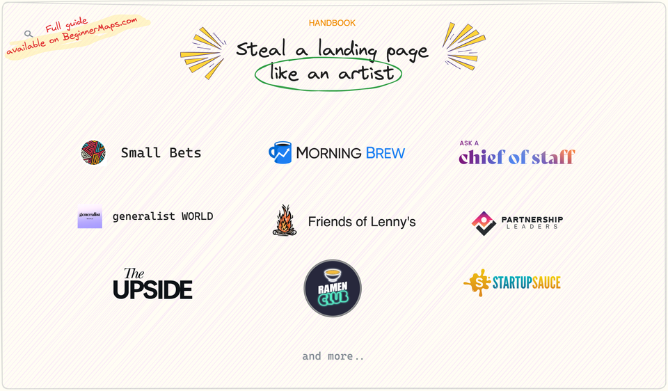
So here are the landing pages of 13 successful community businesses that I’ve interviewed or plan to interview on Beginner Maps:
- Partnership Leaders
- Chief of Staff Network
- Business of Community
- Design Buddies
- Small Bets
- Ask a Chief of Staff
- Generalist World
- The Upside
- Ramen Club
- Morning Brew Learning
- Startup Sauce
- Friends of Lenny's Newsletter
- Brainstorm Road
Browse through them at your leisure to identify the ones that speaks to you and your business. Then, copy the hell out of them!
My favourite elements of these landing pages
If you care about my opinion, here are my favourite elements from each of them:
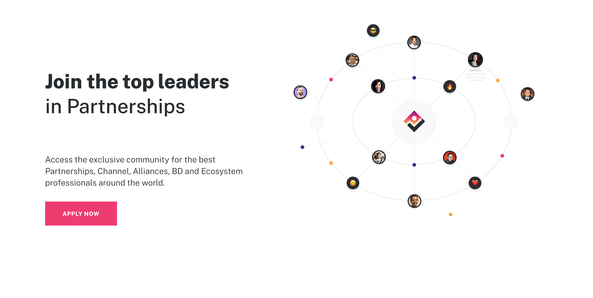
I like the hero image that is basically a network of members in their community.
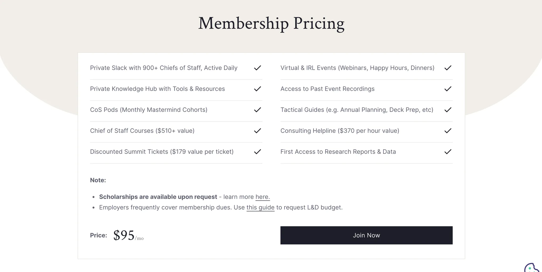
I know some business gurus advise you to make the visitor fill an application form before showing them the price on the landing page. But as a visitor, i appreciate when a community is upfront about their pricing. Ultimately I believe it’s a good strategy as it saves you time weeding out the non-serious visitors.
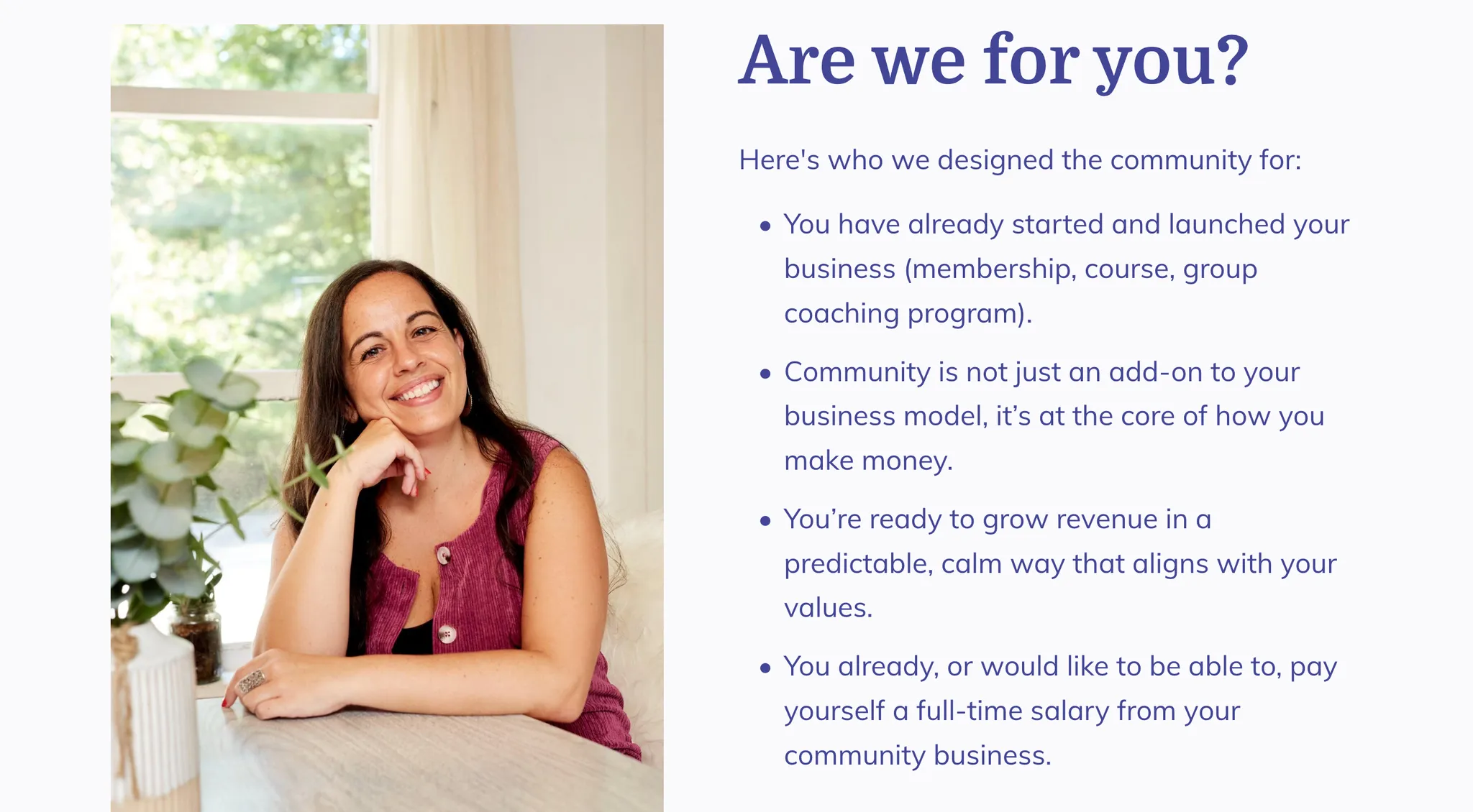
An “are we for you” section that actually excludes the wrong type of people.
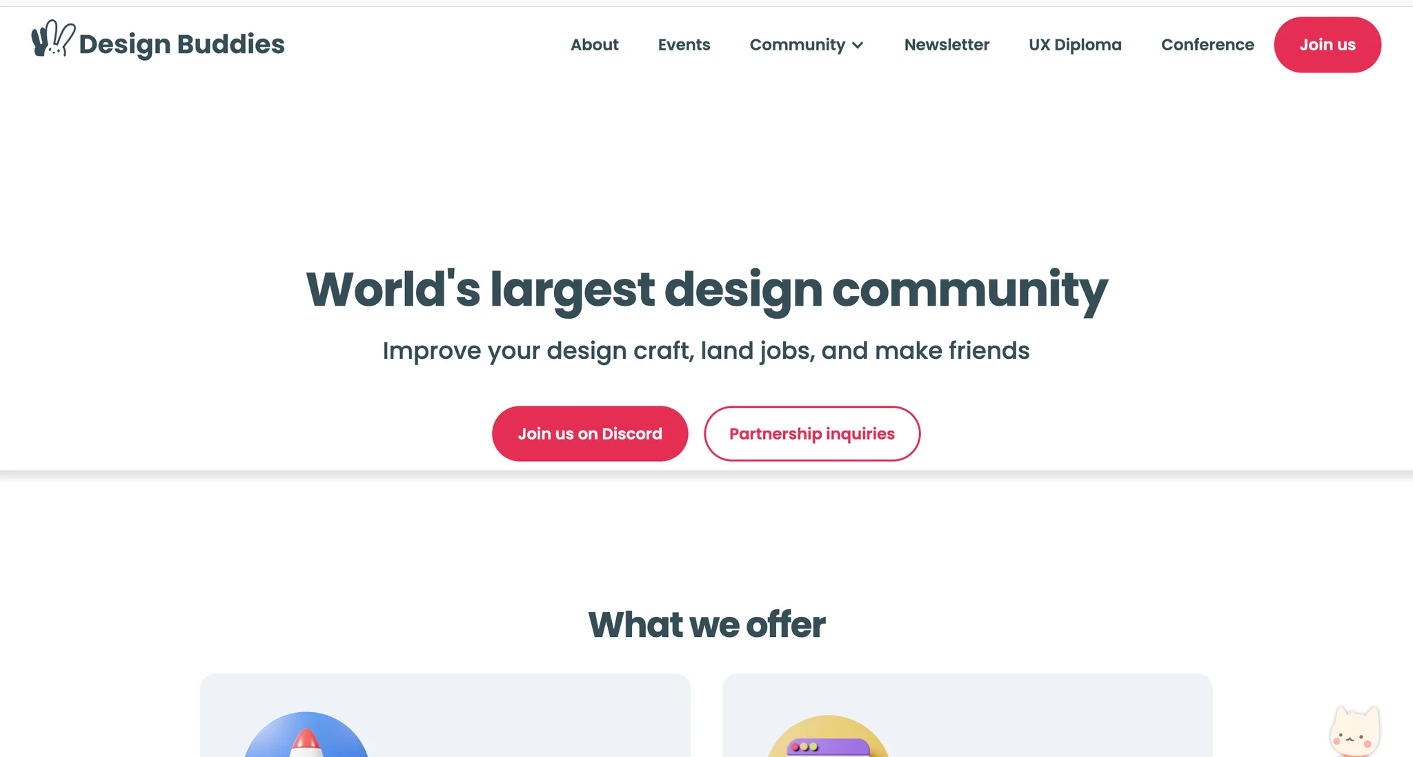
The simplicity of the page - its a free community after all. And notice the 2nd CTA button about Partnership enquiries.
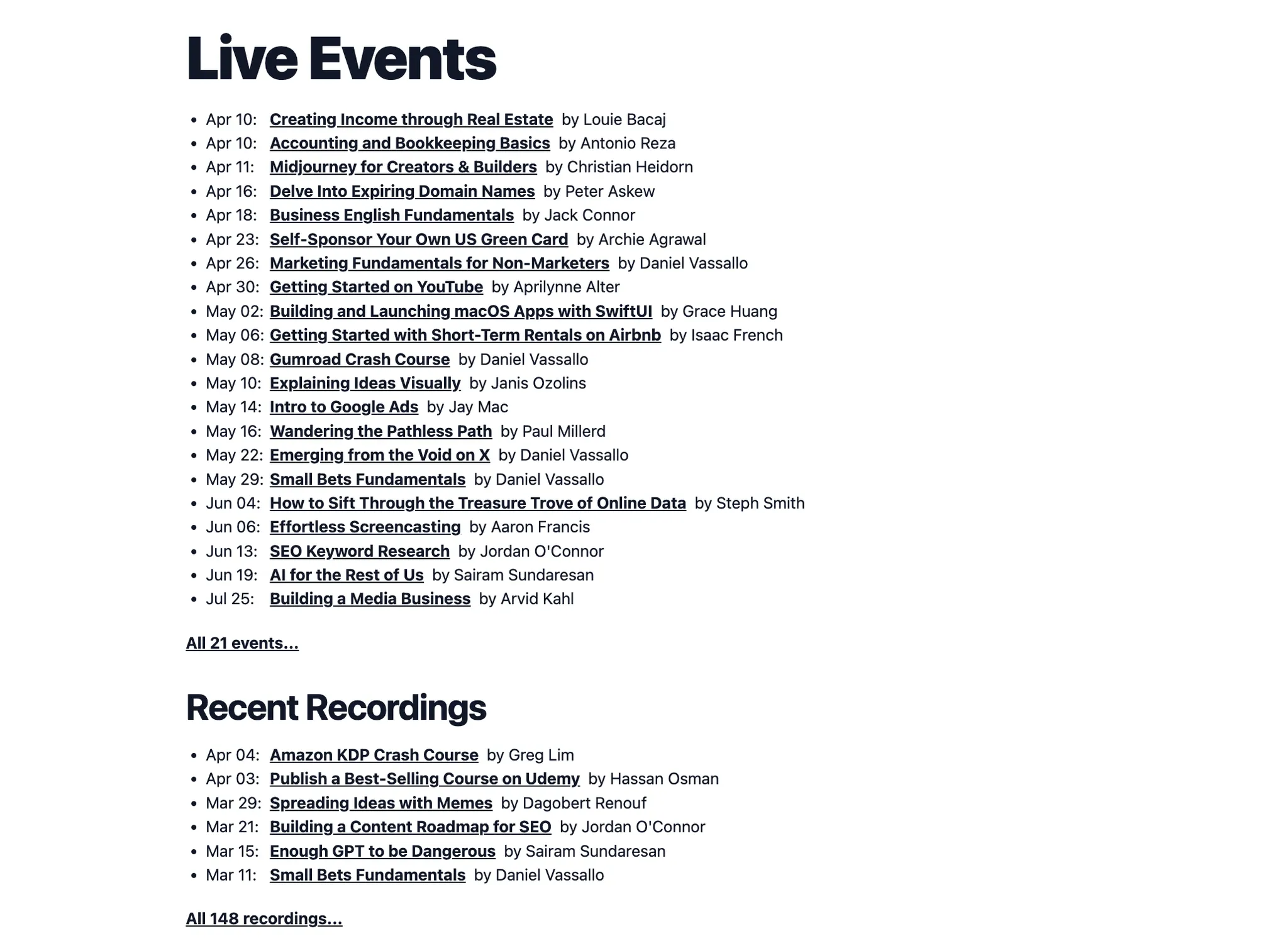
Small Bets’ biggest asset is their awesome content library and live classes. They’ve made sure to highlight that on the landing page along with a paywall with each recording. IMO it’s a missing opportunity for communities that don’t do this.
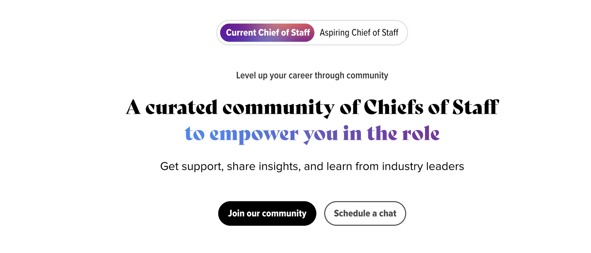
If you serve 2 personas, have a switch to change the features of your membership for each persona.
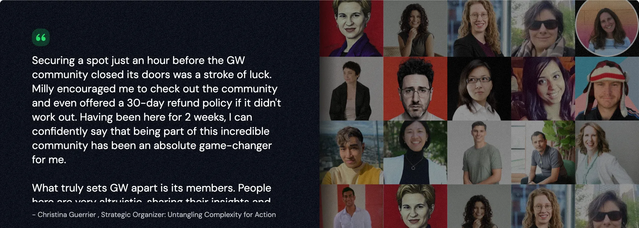
Its a great idea to have a wall of your member’s social media pictures - the visitor will probably recognise a familiar face.
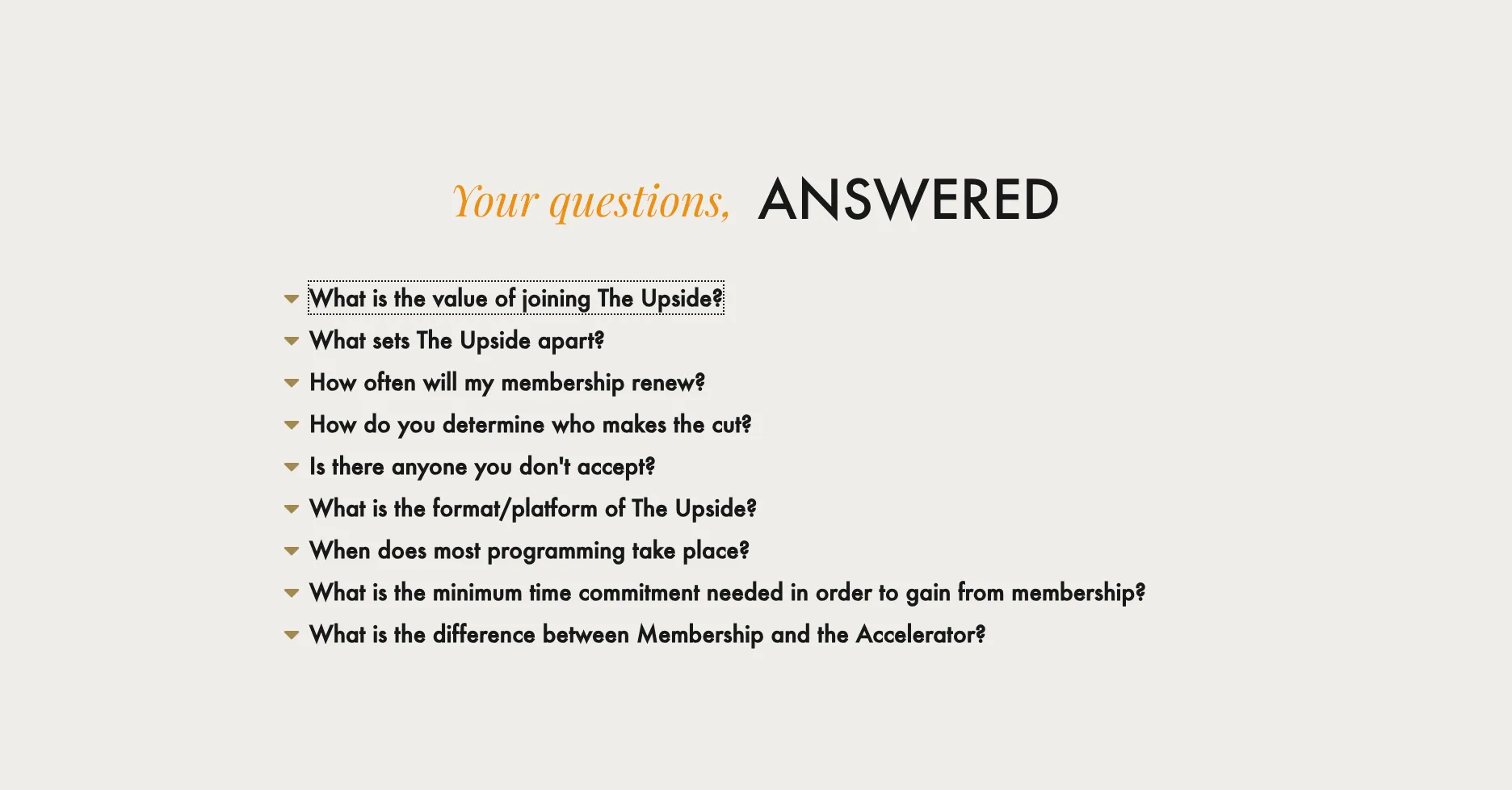
The Upside has the most useful FAQ section i’ve ever seen. You have to read the answers to understand what I mean.
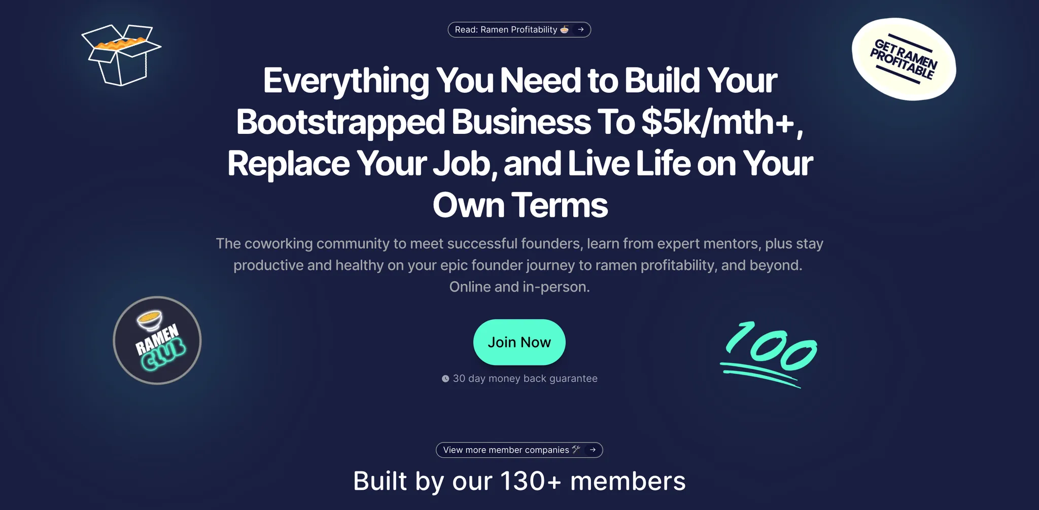
Who said there’s a word limit on the hero section?
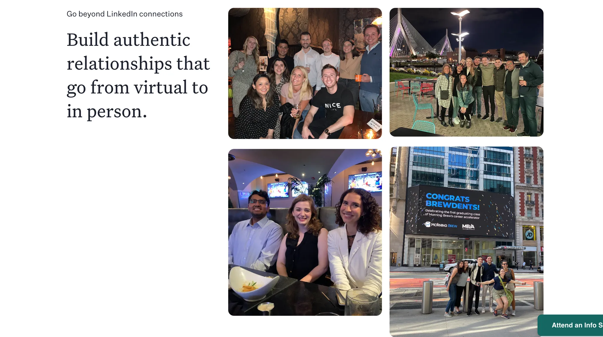
I loved Morning Brew Learning’s section about their connections - “Go beyond LinkedIn connections”. Steal that if you organise in-person meetups. Or even if you don’t.
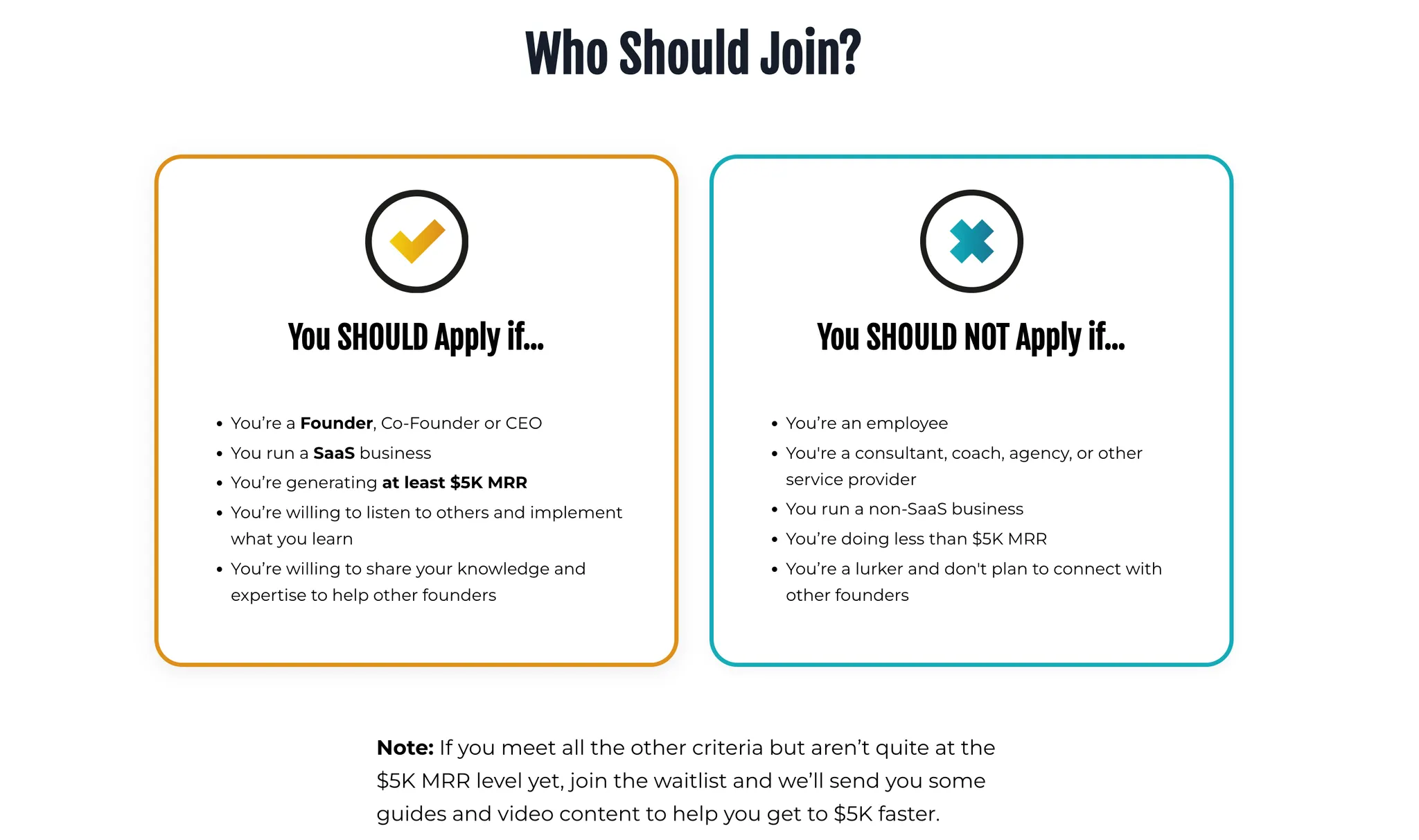
Now that’s a great way to 1) clarify who your community is for 2) build an email list with the people who don’t qualify to join.
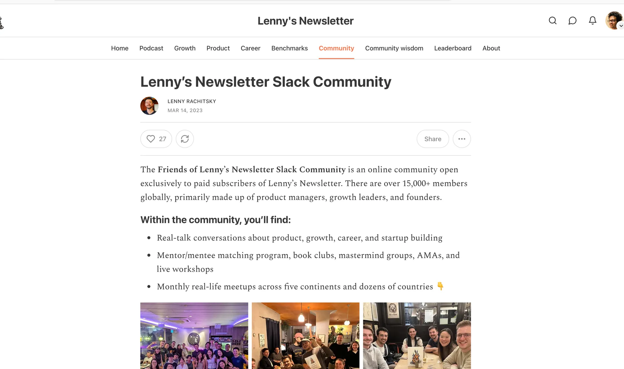
Okay Lenny’s community is an exception. What you can learn from it is if you have a top newsletter in the world that is respected by everyone, you can simply add your community to the Pro plan of your newsletter and it’ll work. Not every paid community needs a fancy landing page.
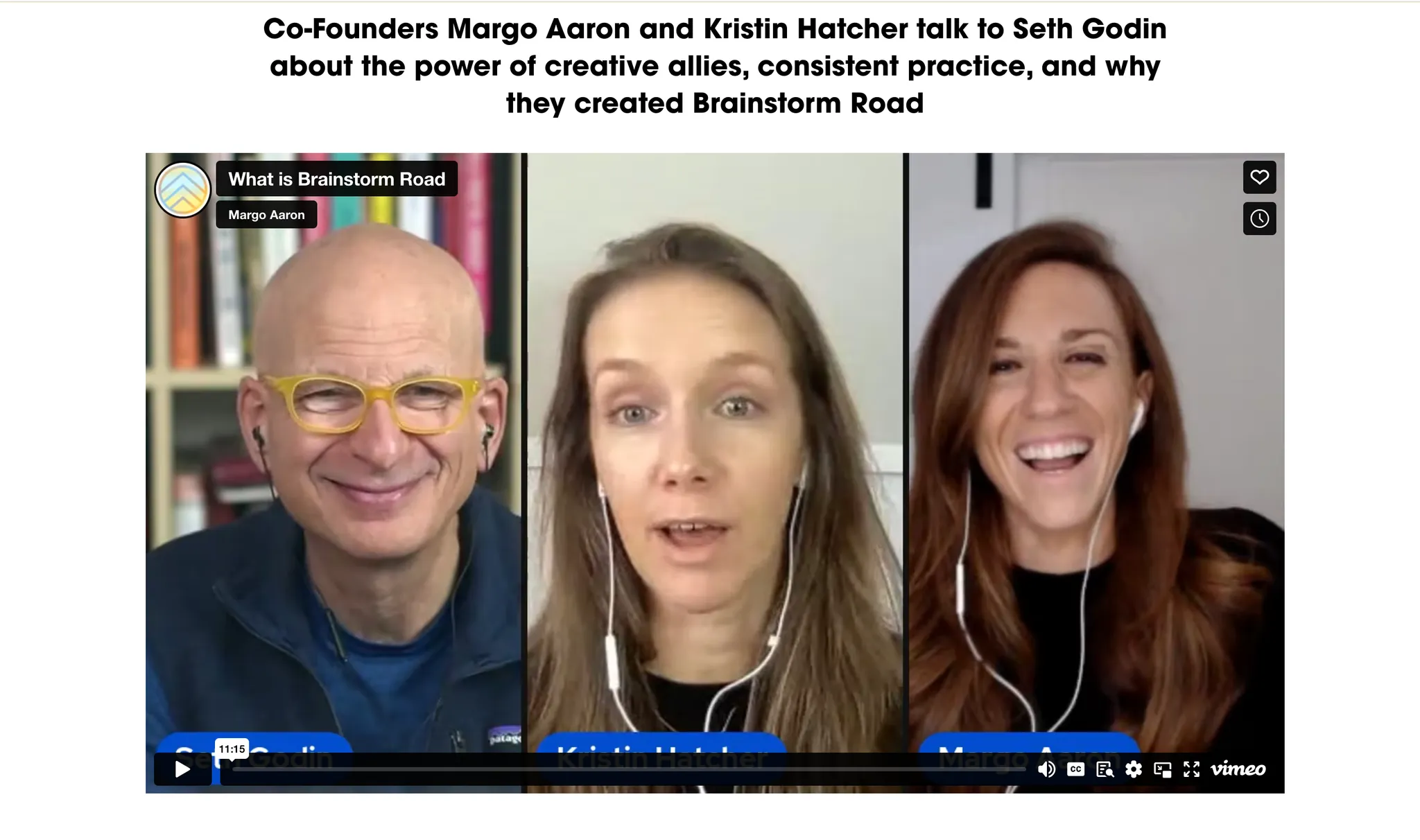
Brainstorm road uses a lot of videos from real people on their website. Client testimonials, a video where the founders discuss the idea with Seth Godin. The energy that the founders show on these videos is infectious.
One advice to rule them all
Finally, I would like to leave you with the advice from one of my favourite articles on the Internet. I try to remember it whenever I’m creating any landing page:

Text for accessibility:
“…if your words are good, people will read them.
If you're a web designer, I challenge you to think about the words first. Instead of starting with a style guide or a Photoshop mockup, start with words on a page.
What do you have to say? If you don't know, there's not much use in adding all that other cruft.”
